Fitness & Brand Identity
South Island CrossFit
Building a stronger brand from the ground up.
Project Overview
When South Island CrossFit came under new ownership, it was the perfect opportunity to redefine how the gym presented itself to both current members and the broader community.
Concrete Egg partnered with the owners to develop a refreshed visual identity that reflected their vision for the future while creating a stronger foundation for the business online.
The project began with brand discovery and strategic planning before moving into logo development, website updates, and refreshed visual assets.
The Challenge
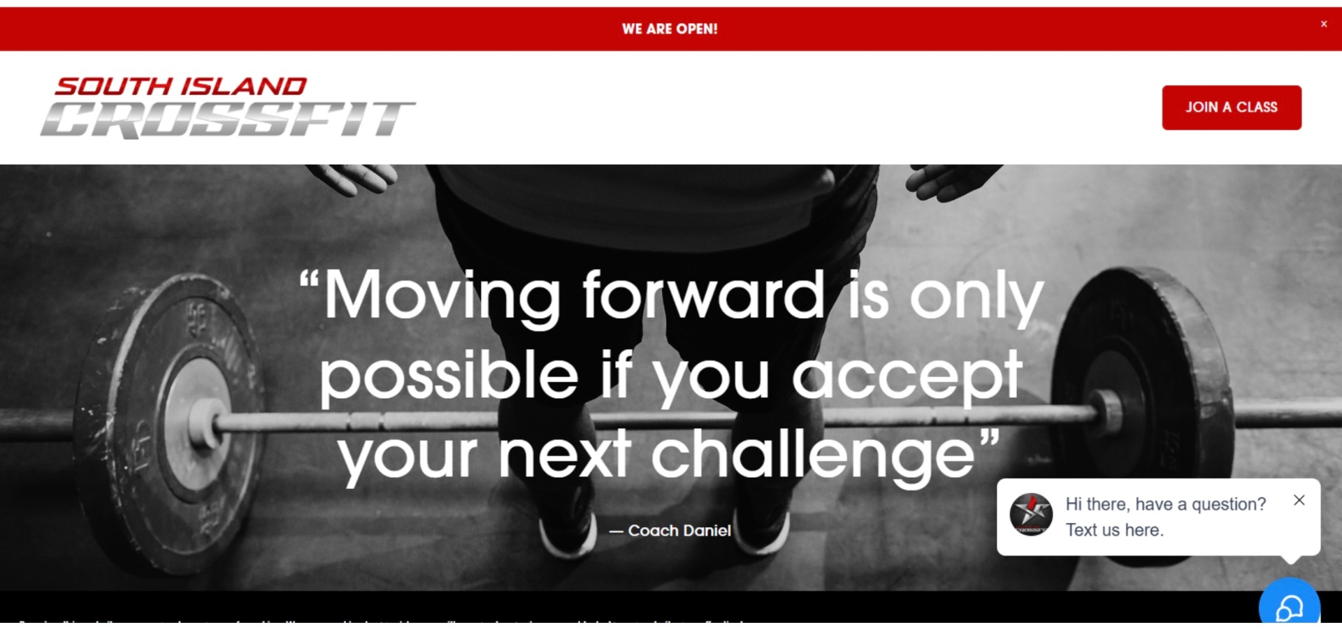
The existing website and branding no longer reflected the direction of the business.
The new owners wanted an identity that felt welcoming, community-focused, and uniquely connected to Whidbey Island while maintaining the strength and energy expected from a CrossFit gym.
Discovery & Brand Strategy
Before any design work began, Concrete Egg developed a Brand Discovery Guide to better understand the business, its goals, and its personality.
Together, we explored brand vision, target audience, community values, differentiators, brand personality, and visual preferences. The discovery process was followed by a collaborative Pinterest inspiration board that helped establish a shared visual direction before design began.
Starting with strategy created a much stronger outcome than designing a logo in isolation.
Logo Development & Refinement
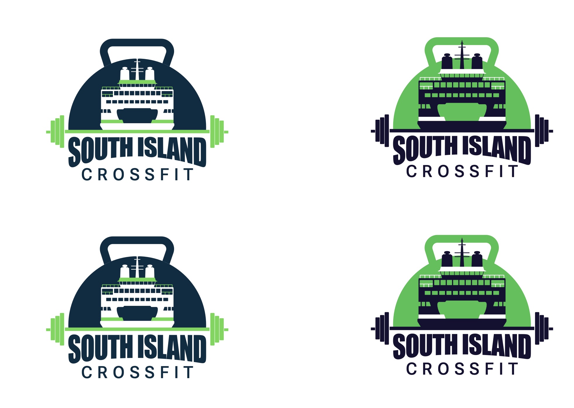
Using insights gathered during discovery, multiple logo directions were explored. Early concepts focused on different ways to represent the gym's identity while incorporating references to Whidbey Island and the Washington State Ferry people generally take to get to Whidbey Island.
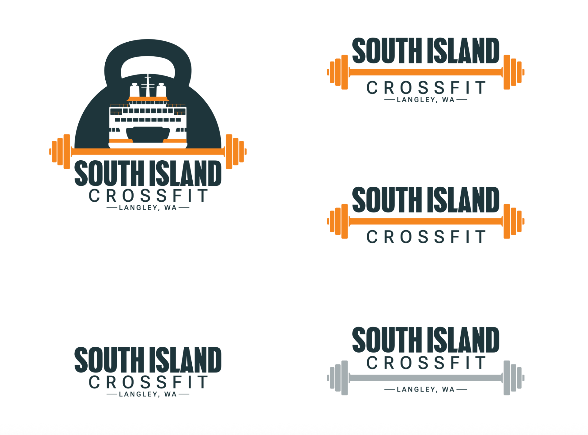
Through several rounds of refinement, the identity evolved into a distinctive logo system centered around a kettlebell and ferry icon — a visual that immediately connects the business to its local community.
Once the overall direction was established, the logo was refined through multiple iterations, simplifying forms, improving legibility, and developing a flexible identity system that could be used across signage, apparel, digital platforms, and print.
Logo Development Process & Final Logos
The Solution
A cohesive brand built to grow with the business.
The final brand identity provides South Island CrossFit with a cohesive visual system that works across digital platforms, merchandise, signage, and future marketing materials.
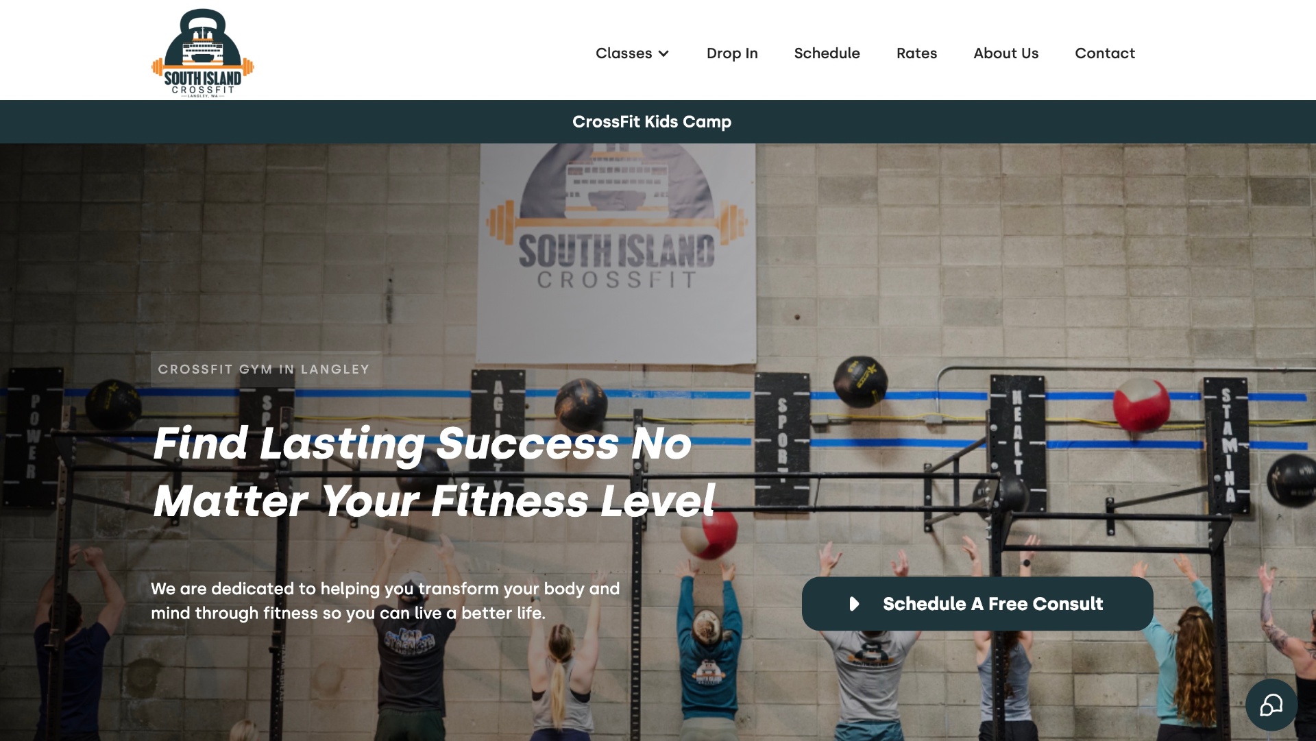
To complete the refreshed brand experience, the website was updated with new professional photography showcasing the gym, members, and community. The updated imagery gives prospective members a much stronger first impression and reflects the welcoming culture the owners envisioned.
Project Highlights
Strategy Before Design
Every creative decision was grounded in a structured discovery process rather than personal preference.
Brand Discovery
A facilitated discovery process helped define the gym's personality, audience, values, and long-term vision before any creative work began.
Visual Identity System
A flexible logo system was developed for use across the website, apparel, signage, and future marketing materials.
Stronger First Impression
Updated branding and professional photography created a more polished, welcoming digital presence.
Built for Growth
The new identity provides South Island CrossFit with a consistent visual foundation that can grow alongside the business.
Services Provided
- Brand Discovery Workshop
- Brand Strategy
- Visual Identity Development
- Logo Design
- Website Visual Refresh
- Professional Photography
- Brand Implementation Support
Looking Ahead
With a clear brand foundation in place, South Island CrossFit has a flexible identity ready to grow alongside the gym, its members, and the wider Whidbey Island community.
Need help defining your brand?
The strongest brands don't begin with a logo. They begin with understanding who you are, who you serve, and how you want people to experience your business.
Let's talk